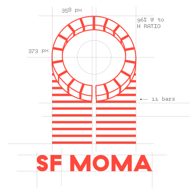
Complete rebranding of the San Francisco Museum of Modern Art for typography studio class. The mark
was developed from the influence of the Mario Botta designed window structure that is a prominent
feature of the museum’s unique architecture. Special focus was dedicated to developing the mark,
as the old system is type only. This is intended to really differentiate the museum
from other contemporary art museums, especially those adopting the ‘MOMA’ acronym.
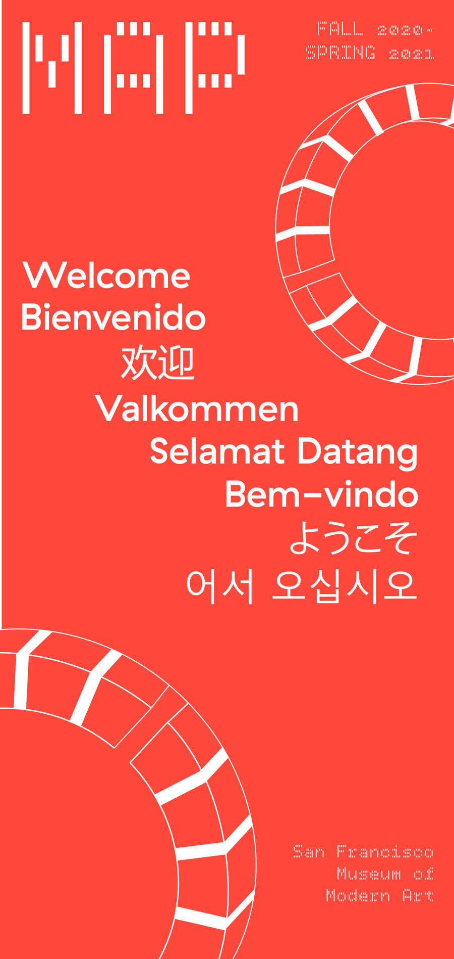
[FALL 2020]

Museum Banner
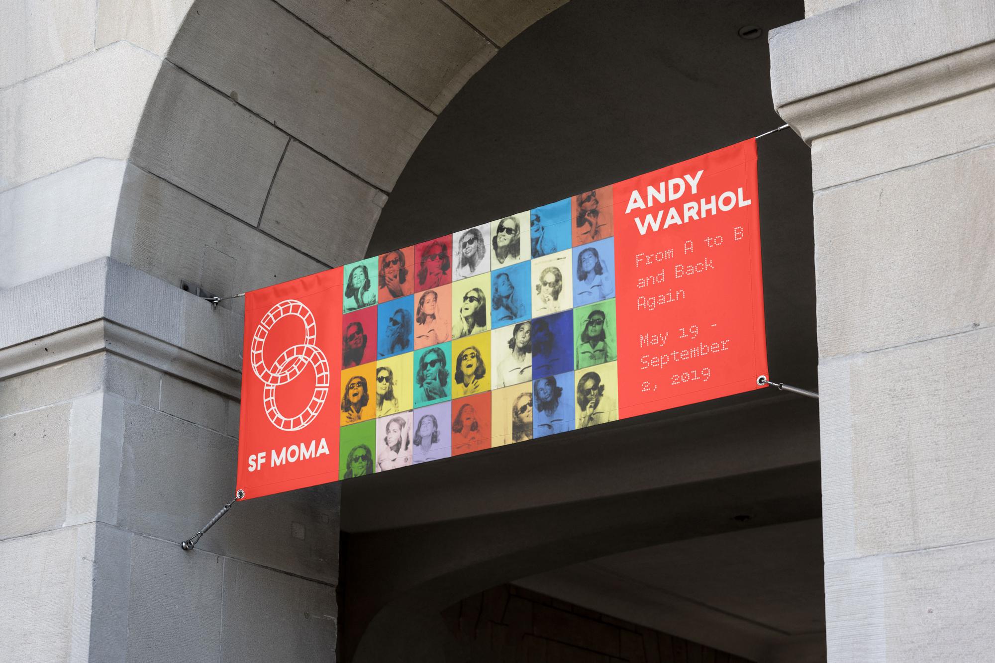
Exhibition Banner

Business Card Front
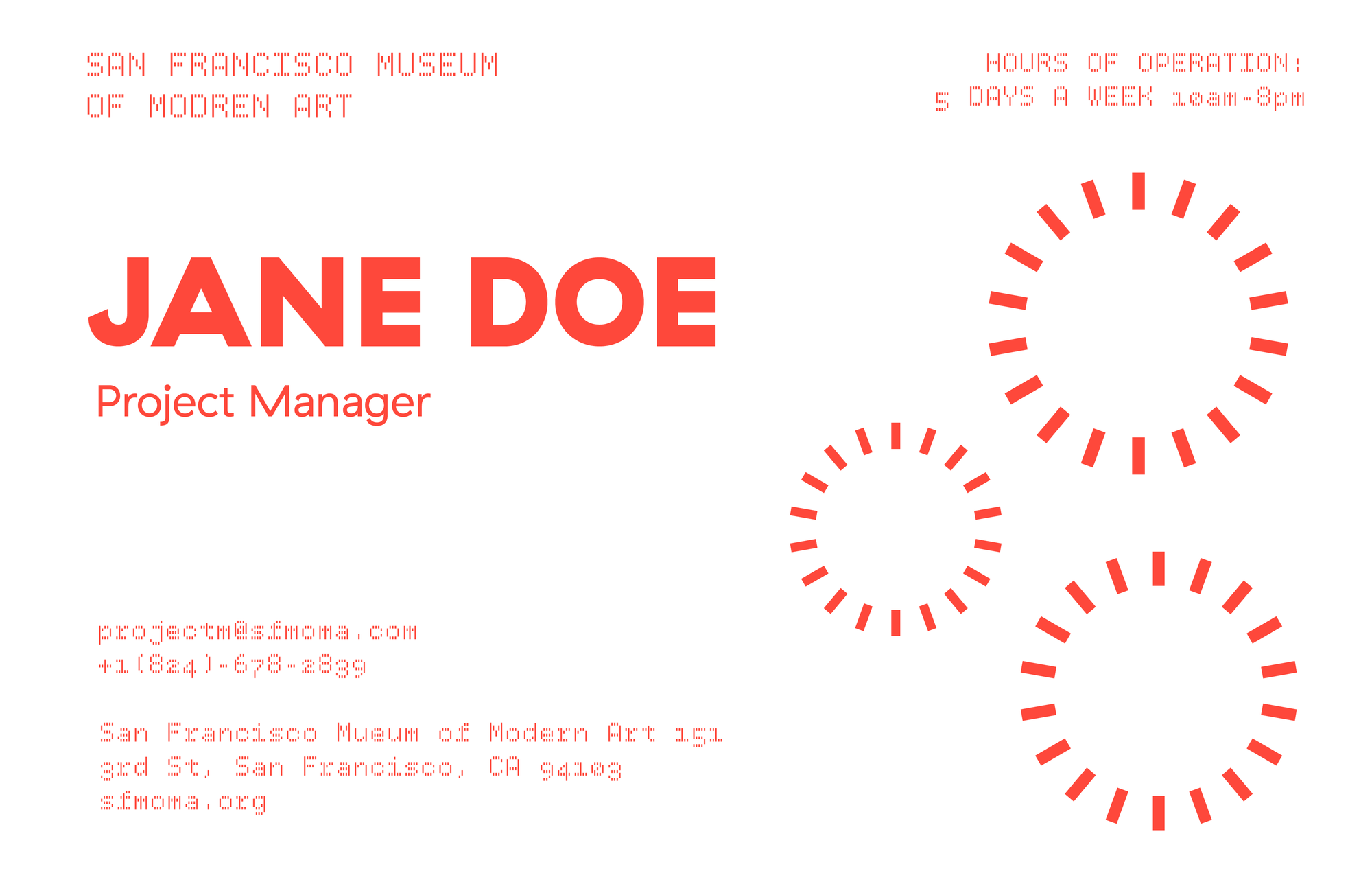
Business Card Back

Letterhead

Back Page

Envelope


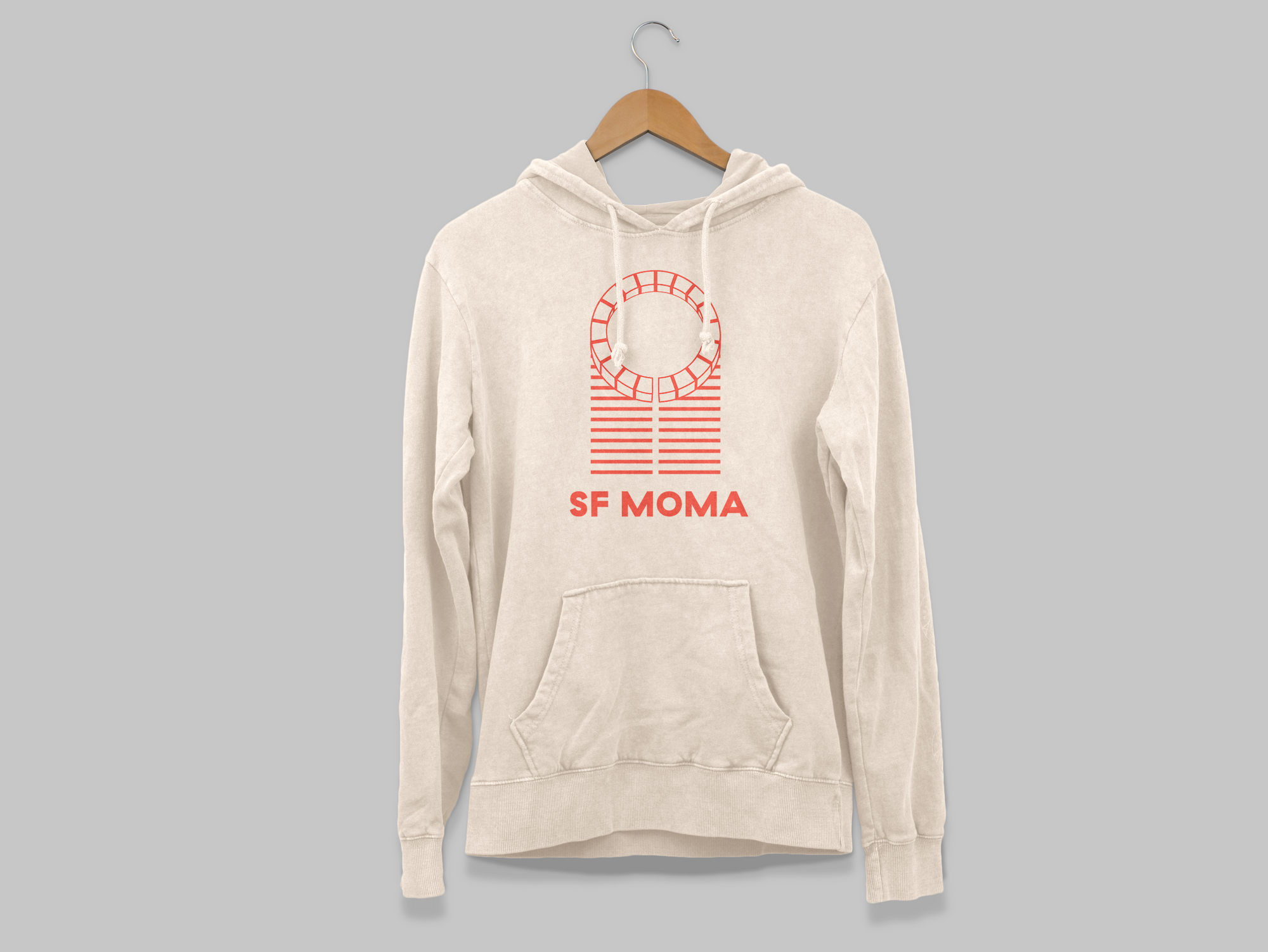
Logo Hoodie

Logo Tote

Museum Maps


Museum ticket example for the museum’s famous Andy Warhol exhibit.

Initial explorations into the logo development.

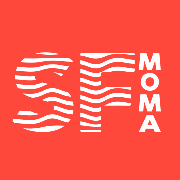
Current SFMOMA Logo

Window Feature designed by Mario Botta in 1995.